How to Read a Minute Stock Chart
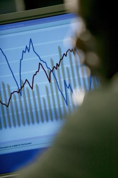
Minute charts provide a close-up view of the day's trading action.
Comstock/Comstock/Getty Images
For fast-acting stock traders, a minute chart gives a detailed, close-up picture of the day's action. A minute chart shows price changes broken down by very short intervals: one-minute, five-minute and ten-minute timespans, over which nearly every large trade will cause a significant (though not always meaningful) change in price. Following a minute chart can put you in profitable touch with the day's price trend.
Open your trading software or go to an online financial website such as Yahoo! Finance or CNBC that provides stock charts. In order to trade on a minute chart, you need streaming quotes, which follow the frequent changes in price live and as they happen. If you have a brokerage accoount, you should be able access streaming quotes. Free sites will have quotes delayed by 15 or 20 minutes, which means the chart will not really be useful for trading purposes.
Step 2Click through the tab on the site home page that indicates "trading," "stocks" or "research." This section of the site will have information on individual stocks, including their price charts. Once you reach this section, enter the ticker symbol of the stock you wish to track; you can look up the ticker symbol, if you're not sure what it is, by entering the full name of the company.
Step 3Access the price charts for the stock you're following by clicking through the tab indicating "charts" or something similar. At the top of the chart will be a tab for "range." Click on the minute interval you're following. The price will be given on the left axis, the time on the horizontal bottom axis. Remember that stock charts display in a variety of formats, the most useful being the classic "candlestick," which graphically shows the high, low and close for each interval.
Step 4Follow the candlesticks as each new one is generated. These narrow rectangles will be color-coded to indicate whether the closing price of each minute interval is above (green) or below (red) the closing price of the last interval. The more green you see, the more uptick trades are occurring, which tend to move the price higher. A new close above the previous high also shows the stock price is gaining upside momentum. A relatively long candlestick shows that the price is moving over a wider range, and is more volatile.
References
Resources
Tips
- Study candlestick charting in your spare time. There are several authoritative books and websites that will help you interpret the various formations and patterns of these charts, which can provide useful clues to the general trading trends.
Warnings
- Trading on minute charts is risky; by definition the information you're scanning in these charts is only the most recent, and gives you very little historical context. A day-trader using a minute chart has to be prepared to move into and out of stocks frequently, and take very small gains to offset any losses. This runs up transaction costs and can lessen your profit in a hurry.
Writer Bio
Founder/president of the innovative reference publisher The Archive LLC, Tom Streissguth has been a self-employed business owner, independent bookseller and freelance author in the school/library market. Holding a bachelor's degree from Yale, Streissguth has published more than 100 works of history, biography, current affairs and geography for young readers.

