How to Read a Stock Market Line Graph
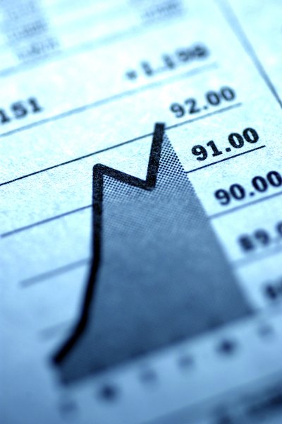
A line chart reveals a history of closing prices.
Thinkstock/Comstock/Getty Images
Line graphs are often used to show trends over time. If you’re following the price of eggs from 1990 to present day, for instance, a line graph can offer a great visual representation of its performance. For stock market analysis purposes, a line graph is used to show how a stock is performing over a specific period of time.
Tip
A stock market graph uses a line to show movement over time. To read it, you’ll trace each stopping point to the dollar figure on the side, as well as the date noted at the bottom of the chart.
Finding a Stock Market Graph
The stock market can be a guessing game if you don’t know what you’re doing. But if you know how to study a stock’s historical performance, you can make more informed investing decisions. A stock market line graph is an easy way to see how a stock has performed over a period of time.
There are sites that will help you access various stock market line charts for a fee. However, you don’t have to pay to play. The Nasdaq composite has free stock market charts available on its site. Just input a stock ticker and choose “Line” as the chart type. You can also compare your stock of choice to up to 10 others, choose the date timeline and specify whether you want to see split, earnings or both.
Reading a Stock Market Graph
Reading any finance graph means first paying attention to the data surrounding the chart. A stock market line graph will generally have the timeline on the bottom and the data being tracked on either the left or right side. If you’re viewing the money it earned in that time, you’ll see dollar figures on the side.
To follow the trends, simply match up where the line falls on the stock market line chart and match the level to the dollar amounts on the side. If you see a spike, follow the line downward to note the date. For example, Microsoft had a sharp spike in October 2018, when its shares were worth approximately $115 per share.
Utilizing Stock Market Information
Reading a stock market line chart is only the first step. For it to be effective, you’ll need to put what you learn to use. This starts with understanding what the price trends mean over time. With the Nasdaq’s line charts, you can look at time periods ranging from five days to 10 years. You can also look at the intraday line graph, which shows you how it has performed on the day in question.
As with any finance graph, it can be helpful to look at a variety of time frames to get a true feel for a stock’s performance. Savvy investors tend to look at weekly and monthly charts to get a more reliable view of how prices are fluctuating. Although it is important to pay close attention to what has happened in recent weeks because it shows how market conditions currently are, it’s also important to look back over the past few years to see how a particular stock typically performs. It can also help to make side-by-side comparisons of competitors to see if one stock tends to perform better than others overall.
Other Stock Market Chart Types
Line graphs are only one way you can view stock market trends. Some common types of stock market graph presentations include bar charts, candlestick charts, point and figure charts and price scaling charts, each with its own benefits.
A bar chart is another very popular type of finance graph, generally used to compare multiple objects. For investment purposes, it’s often used to show the high, low and close price for a stock. Candlestick charts are also used to represent these elements. A point and figure chart shows noticeable price movement over time in an easy-to-understand illustration.
References
Tips
- Although a line chart is simple, it excludes information that other types of charts provide, such as a stock’s opening, high and low price each period. It therefore doesn’t show a stock’s price movements between closing prices.
Writer Bio
Stephanie Faris has written about finance for entrepreneurs and marketing firms since 2013. She spent nearly a year as a ghostwriter for a credit card processing service and has ghostwritten about finance for numerous marketing firms and entrepreneurs. Her work has appeared on The Motley Fool, MoneyGeek, Ecommerce Insiders, GoBankingRates, and ThriveBy30.

